How to make a Manga and find an artist
A beginner-friendly walkthrough of writing a manga in plain text, using the script Barnicus made in real time by Pistol Taeja.
Panels are the artist's clock — how size, shape and gutters bend time on the page.
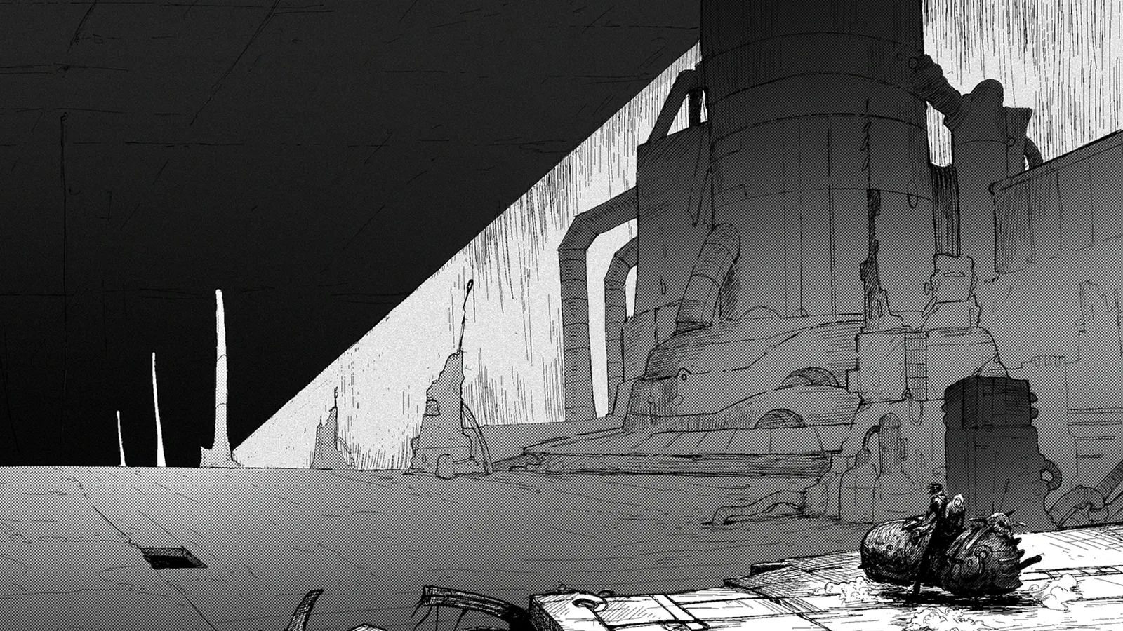
When you are structuring a horror comic — or any comic — the single biggest variable you have to master is time, and how the reader perceives it on the page.
Basically, there are drawings near each other, each representing a new moment in time — duh!
That definition encapsulates the obvious, but what are the techniques that help artists embody the time perception of the story? Are they even that important?
For reference, another medium that relies on visual sequence and storytelling is film. You can take a camera, press the record button, have some general idea of how to compose and light a shot, and you can make your own movie.
The point is, you do not have to think about the way the viewer perceives time in your narration; in its most basic form, the camera films in real time. Well, if you want to make your own comics, you do have to think about it.
Comics are juxtaposed panels in space. Everything exists there, in front of you, at any given point in time.
You are limited to thinking in pages or spreads, but the idea is that you have to give the reader the illusion of time passing.
What moments do you decide to show, how much do you emphasise a panel, how big or small are they, what is their shape, what is the gutter size, are there things sticking out of the panel — all these details can help you organise the space in front of you to better convey feelings and pace your story.
There are basic rules that can guide you, such as:
But these rules are in place to guide you, not restrain you.
The way we play with these rules — whether we're structuring a comic or structuring a manga — depends on the feelings we want to convey to the reader.
For example, this is the first illustration the reader sees when opening my upcoming comic book Zeno.
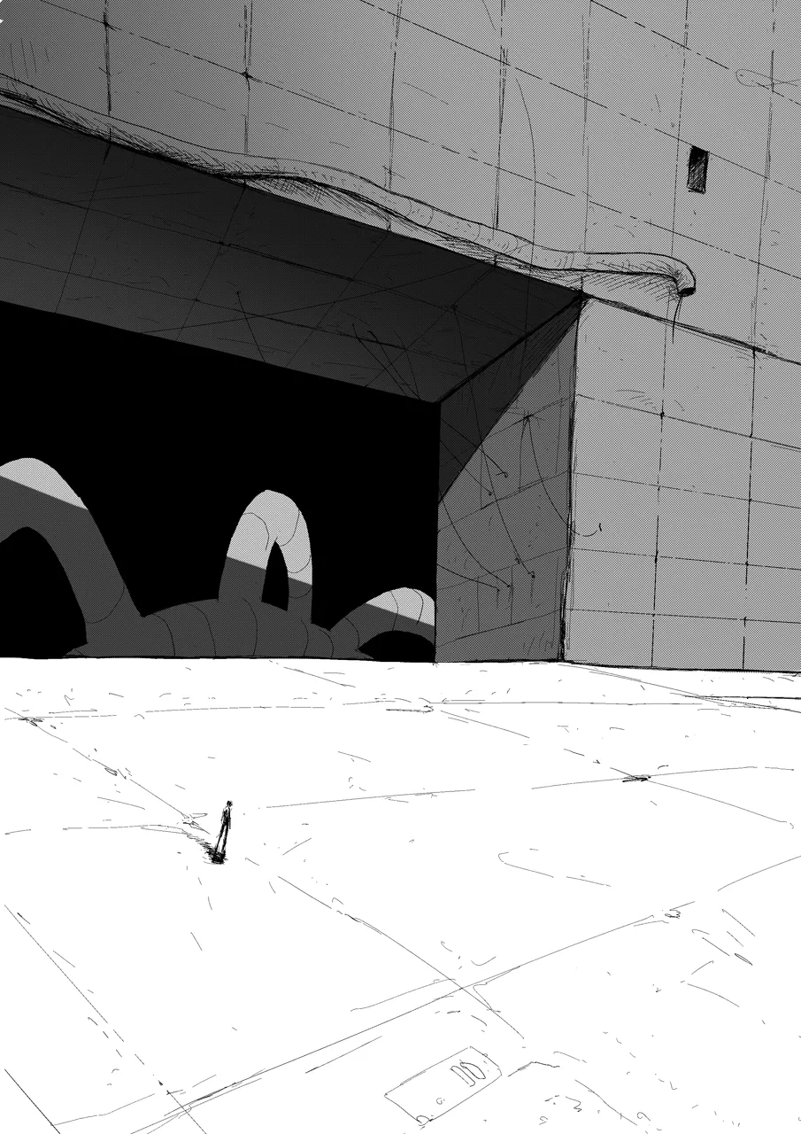
Why it looks this way is not random at all. This is a splash page (the page contains one big illustration).
The environment is huge, so it makes sense to lead the reader in with this big page — but another idea behind it is that a page this big is made to highlight the characters and situation, making the reader spend a little more time looking at it, deciphering it, wondering.
This page represents the first contact the reader has with Zeno, a lonely and mysterious woman who explores the seemingly infinite world she is in. This is the most basic and essential information I can give you about the project, so this has to be the first page — so that you know what to expect next, kind of like a trailer.
The word "information" encapsulates the feeling aspect as well, as feeling is one of the primary defining goals of the project. You need to feel the empty, desolate, post-apocalyptic world she lives in, so, as the artist, I will give you the time to take it in.
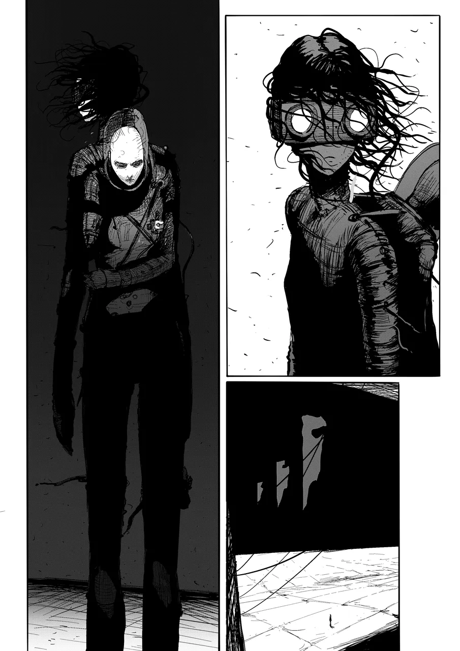
In the close-up of the characters, the same idea — letting the viewer observe — is the backbone of the paneling and composition of the page. Three panels, each showing seemingly the same situation: Zeno, looking to the left. The characters are on a runway. The reader needs to observe Zeno, they need to see the person on her back, the goggles, the size contrast between her and the world.
Nothing happens; time is seemingly standing still, and at the same time we have no idea how much time exactly has passed between the panels. She could have looked for a few seconds, 5 minutes, or even 10 minutes.
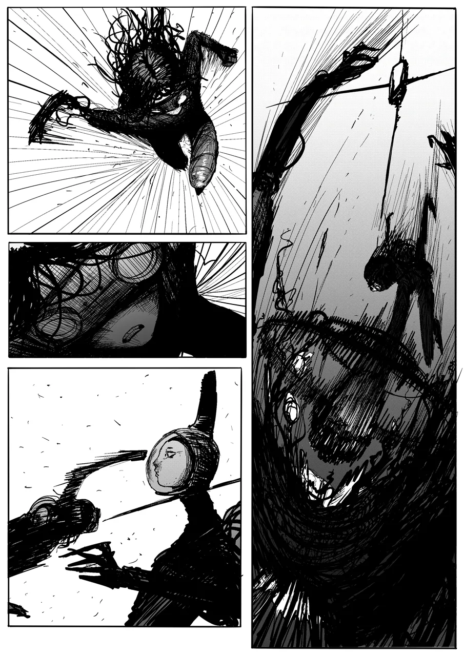
When it comes to action, time is shown in a clearly defined way: the panels show the essential action and poses, working like keyframes. For example, the panels on the left side are smaller and easy to read.
They are meant to convey speed; they show the key poses of how Zeno moves towards the target. The first panel is her charging the punch, the second is her expression during it, the third is the exact millisecond before the impact.
Then comes the impact panel, taking half a page. We see everything — the head exploding, the arched body of Zeno.
Even though the action happens fast, the panel is big because at the end of the day, Zeno obliterating an enemy is fun to see; it is entertainment. You need to break the rules in favour of making a show, letting the reader see the fun, not miss it.
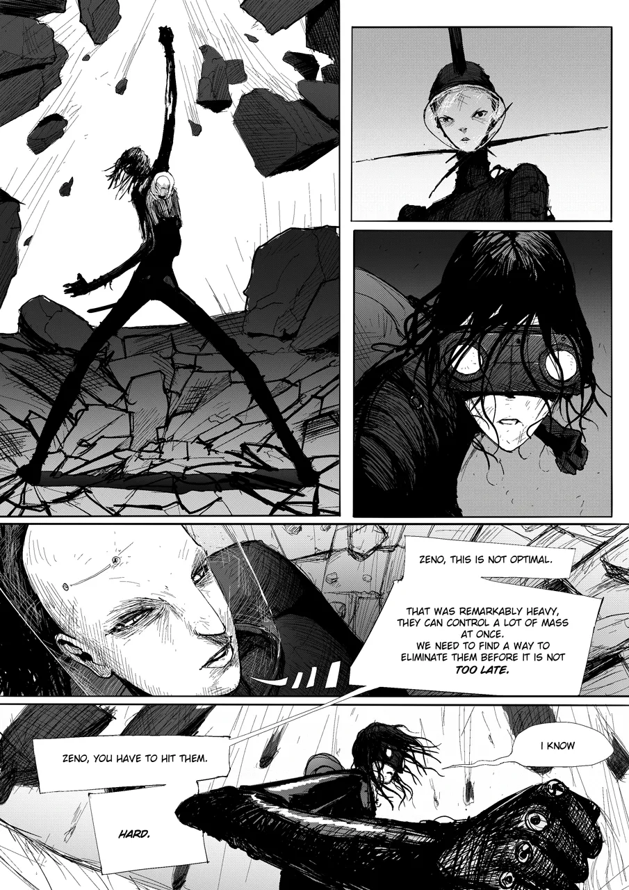
Another example of how giving the viewer time to observe is going to create emotion.
The first panel is Zeno breaking a huge boulder that the enemy threw at her. Beat.
It is the first time the reader sees the power of Zeno. The next two panels are for the characters to react to each other's capabilities, but also for the reader to take in the new situation created by the reveal — Zeno is really powerful; she destroyed a huge chunk of stone thrown at her.
They take a good look at each other, assessing the situation.
The idea here is that the reader really has time to pause and think alongside the characters, to feel the tension. That controlled tension is what separates horror graphic novels from action ones — pacing IS the scare.
The core idea is that we, as artists, have to be conscious of time — how and when we pause it, speed it up, or make it stand still. With practice, these become tools at your disposal.
The truth is, if you are familiar with these seemingly rigid rules, they will come to you naturally when you are focusing on your story and the feelings you want to convey.
You can find more work by Onisim Bouariu here.

A beginner-friendly walkthrough of writing a manga in plain text, using the script Barnicus made in real time by Pistol Taeja.
A beginner-friendly walkthrough of writing a manga in Google Docs — pages, panels, action, dialogue. No drawing software, no expensive tools, just plain text.
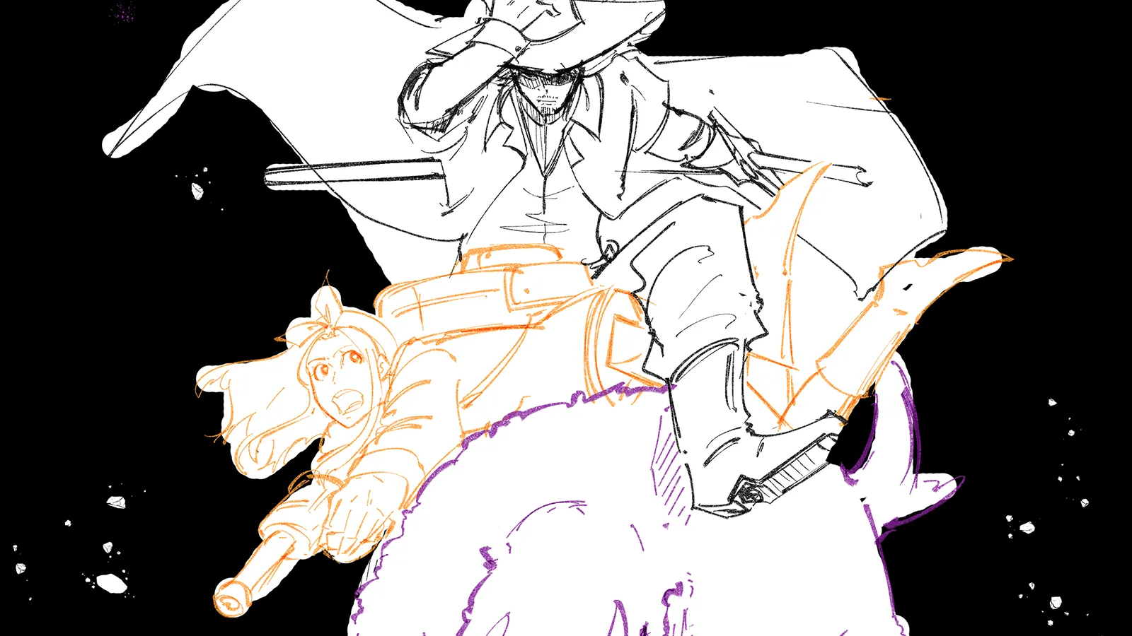
Wonder no more, a real comic script is used side-by-side the production art to show how to write a comic script or graphic novel.